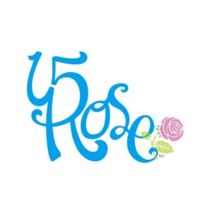
A small touch up, made the ‘1’ more like a ‘1’, fattened some of the limbs, and took away the “ave” in place of a rose. The change came about when making the clients business card, and he asked if I could change the logo and make the ‘1’ look more like a ‘1’…
Leave a Reply