
Took the mini 2 out for a look during WinterFest….
graphic design

Trusty Oak Time Harvested Well
After 3 years my contract has come to a close and I’ve parted ways with one of the best positions…
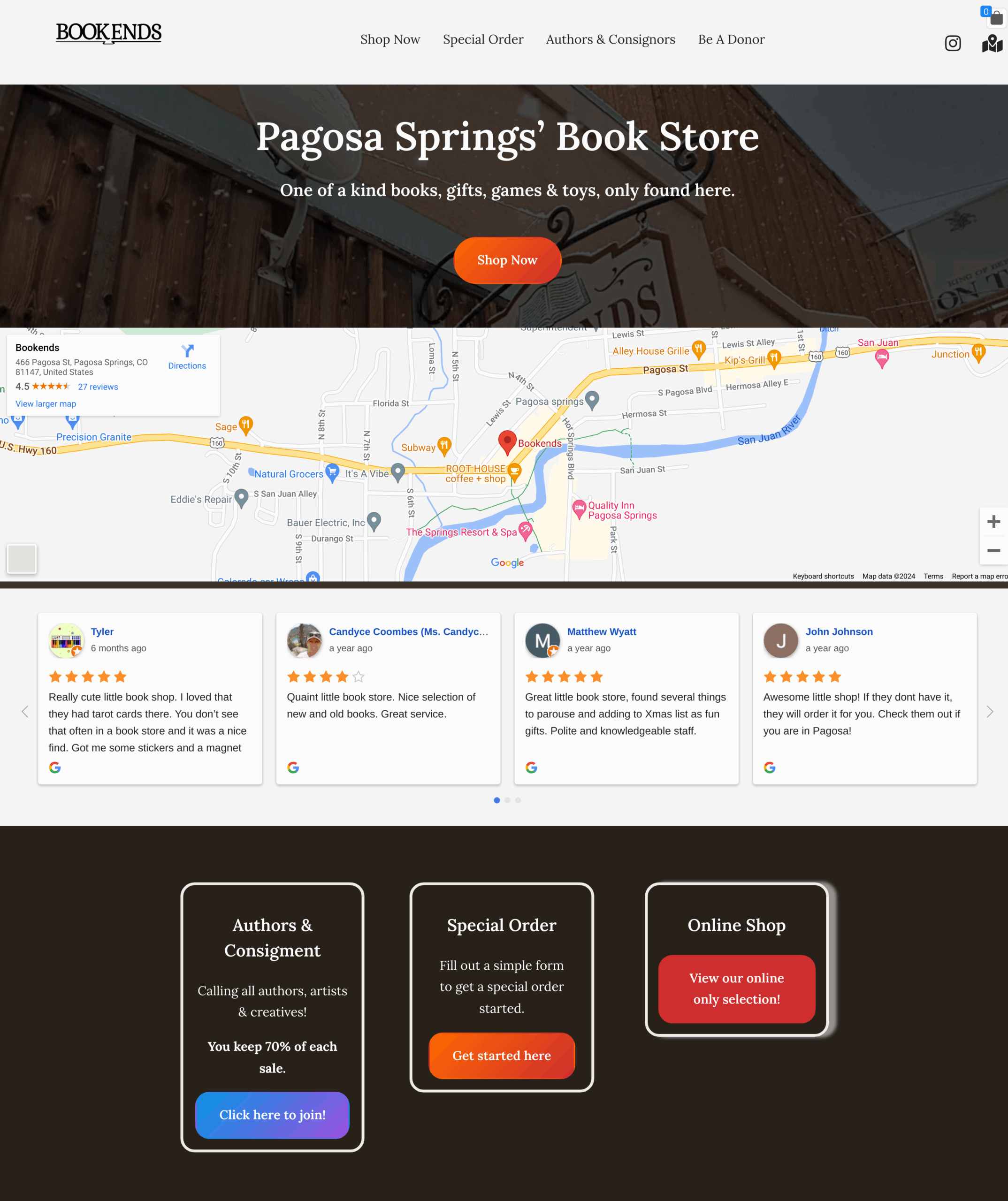
Shopbookends.com
Built a Wordpress site for the Bookends in Pagosa Springs. https://shopbookends.com printful integration woocommerce store block theme…
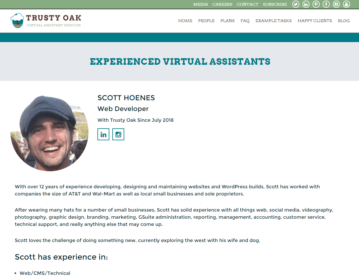
Now Available at Trusty Oak
Find me at Trusty Oakor find another supportive and knowledgeable VA from our team…
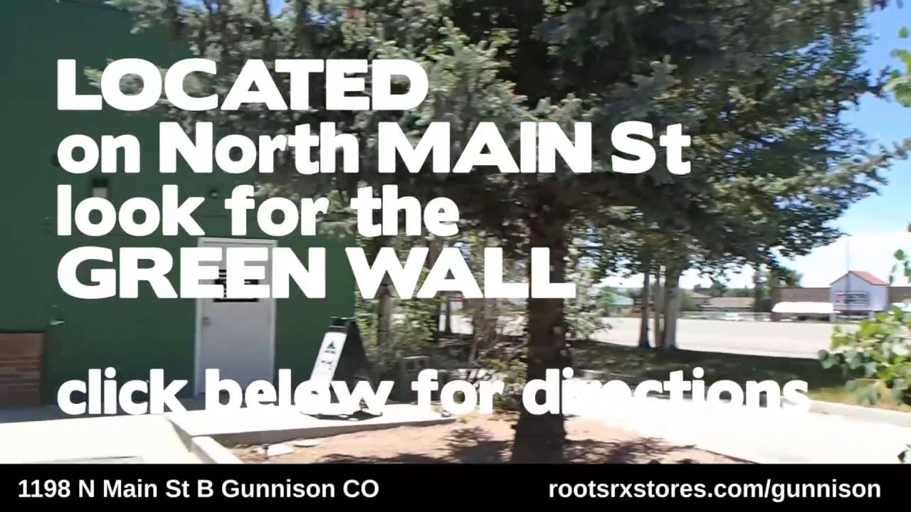
Roots RX Gunnison Video Ad
https://www.youtube.com/watch?v=DIz9i_SEv60 Shot and edited this video ad for the store I’m managing in Gunnison. Mel and I acted in and shot the video…
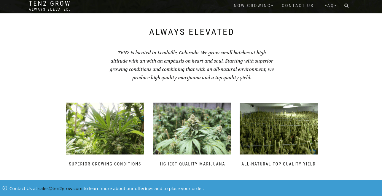
TEN2GROW.com site build
Built ten2grow.com on wordpress with woocommerce. Woocommerce was perfect to display products even if we don’t need to sell them online….